LGBTQ Population By State: How It’s Changing Nationwide Now

Baseball fans argue about batting average. Coffee people argue about pour-over. And in the U.S., one of the biggest quiet shifts is about identity: more people are openly identifying as LGBTQ+ than in past decades, and that change does not look identical in every state.
This is where LGBTQ population by state becomes more than a map curiosity. It hints at where younger adults are settling, where acceptance is rising, where people feel safe enough to be counted, and where survey methods capture (or miss) parts of the community.
One quick reality check: there is no single perfect number. Different surveys measure different things, at different times, with different sample sizes. Gallup reported 9.3% of U.S. adults identifying as LGBTQ+ in 2024. The Williams Institute, using pooled 2020–2021 BRFSS data, estimated 5.5% of U.S. adults identify as LGBT and publishes state-by-state estimates. Both can be useful. They’re just built differently.
LGBTQ Population By State
If someone wants a grounded starting point, the Williams Institute’s BRFSS-based estimates are a solid snapshot for comparing states. In that report, Oregon, Delaware, Vermont, New Hampshire, and Washington appear among the higher-percentage states, and D.C. stands out at 14.3%.
At the same time, large states like California, Texas, Florida, and New York have some of the biggest total counts simply because they have so many residents. That’s a detail people miss. “Highest percentage” and “largest number of people” are not the same thing.
A quick mental model helps:
- Percent tells you concentration
- Count tells you scale
What People Mean When They Ask For State Breakdowns
When someone searches LGBTQ demographics by state, they often want a simple leaderboard. Highest to lowest. But the story is messier, and honestly more useful.
State-level estimates are shaped by a few forces at once:
- Who lives there (age mix, urban vs rural balance)
- Who moves in and out (jobs, school, cost of living)
- How safe it feels to self-identify (culture and policy climate)
- How the data was collected (question wording and sample size)
So yes, a state can show a larger share of LGBTQ adults because it’s more welcoming. Or because it has more young adults. Or because it has major metros that attract LGBTQ residents. Often it’s all of the above.
Why The Share Appears To Be Rising
The biggest driver of LGBTQ population growth is not that people suddenly became LGBTQ+. It’s that more people feel able to say it, and younger generations report LGBTQ identities at much higher rates.
Gallup shows much higher LGBTQ identification among younger adults than older adults. The Williams Institute BRFSS analysis shows a similar pattern: 15.2% for ages 18–24 versus 1.8% for adults 65 and older. Pew also reports a wide generational gap in LGB identification.
So when a state gets younger, or when young adults move in, the measured share often rises. That’s demographic math plus social change, not a sudden wave.
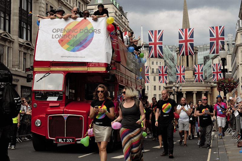
Migration And Metro Gravity
People relocate for work, school, relationships, affordability, and quality of life. LGBTQ people do the same, but the “where” can be nudged by a few extra considerations like inclusive healthcare, non-discrimination protections, and whether there’s visible community.
Over time, this creates clustering around certain metro areas, even inside states that look mixed overall. A state can sit near the middle of the pack while one city inside it feels like a completely different world.
That’s one reason LGBTQ community trends can feel confusing. The state number is a summary, not a street-level view.
Suburbs matter, too. As LGBTQ adults build careers and families, the story spreads beyond downtown. Small towns can shift quietly, one neighbor at a time.
Policy And Culture: Not The Only Lever, Still A Lever
It’s tempting to say “more protections equals more LGBTQ people.” Reality is complicated. People don’t always have the ability to move, and many LGBTQ residents stay put because that’s home.
Still, policy and culture can influence visibility. In environments where people fear discrimination, some may be less likely to disclose identity on surveys. Research has examined how policy context and survey estimates can relate.
So when you see differences across states, it can reflect both who lives there and how safe it feels to be counted.
On a Similar Note: LGBTQ Social Acceptance in 2025: Shifts and Challenges
Why Different Surveys Disagree
If one source says 9.3% nationally and another says 5.5%, that’s usually methodology, not “one is lying.”
Common reasons results differ:
- The identity options offered (LGBTQ+ vs LGBT, more labels vs fewer)
- How people are contacted (phone vs online)
- Whether data is pooled across years to stabilize small samples
- Who skips sensitive questions
The Williams Institute report notes pooling multiple years of BRFSS data to stabilize state-level estimates. Gallup’s estimate comes from its own polling approach and annual updates.
A practical takeaway: use state-focused sources for state comparisons, and trend-focused sources for national change over time.
How To Read The Map Without Oversimplifying It
Here are a few quick checks that make any map of LGBTQ population by state more meaningful:
- Don’t compare states without checking year and method
- Don’t assume a lower estimate means fewer LGBTQ people exist there
- Separate percentage from total count
- Expect big metro areas to influence state averages
- Treat small differences cautiously
If someone wants a fast self-check, ask: “Am I reading this as a culture story when it might be a demographics story?” That one question prevents a lot of bad takes.
What Changes Might Look Like Next
If current generational patterns hold, places with younger populations and strong metro job growth may keep showing higher measured LGBTQ shares. States with older populations may shift more slowly, even as acceptance improves.
Measurement may change, too. As surveys refine sexual orientation and gender identity questions, estimates can become more precise and sometimes rise because the counting gets better.
And yes, that feeds back into LGBTQ population growth conversations, because “growth” can mean more openness, better questions, and real migration all at once.
Also Read: What Is a WLW Relationship & How It Differs from Lesbians?
Conclusion: How These Numbers Are Used In Real Life
The value of LGBTQ demographics by state is practical:
- Planning healthcare and mental health services
- Funding community safety and support programs
- Building inclusive workplace policies that match local reality
- Helping schools and universities plan student support
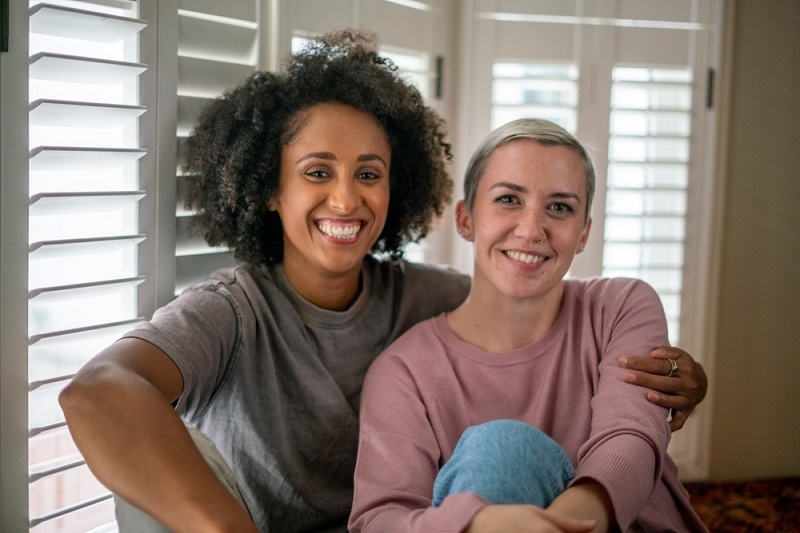
And for individuals, it can be personal. People use patterns and local reports to ask, “Where might I find community?” That’s normal. It’s human.
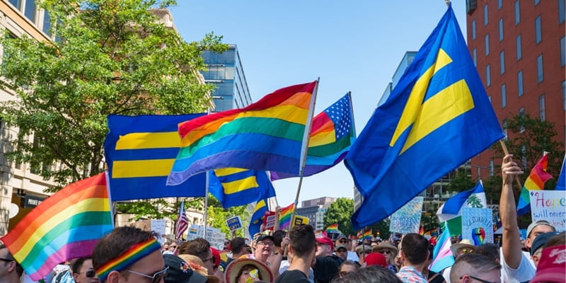
Also, don’t ignore the everyday signals of LGBTQ community trends beyond surveys: local organizations, Pride attendance, campus groups, and workplace networks. Data is one lens, not the whole scene.
FAQs
Why Do Some States Show Higher LGBTQ Shares Than Others?
States differ in age mix, metro concentration, migration patterns, and how comfortable people feel self-identifying. Survey method also plays a big role.
Is LGBTQ Population Growth Mostly About People Moving?
Migration matters, but the bigger driver is generational change and greater willingness to self-identify. Younger adults report LGBTQ identities at much higher rates.
What Source Is Best For Comparing State-Level Patterns?
For state comparisons, sources built for state-level estimates, such as pooled BRFSS analyses, are often more stable. For national trendlines, repeated large polls can help.